adobe illustration
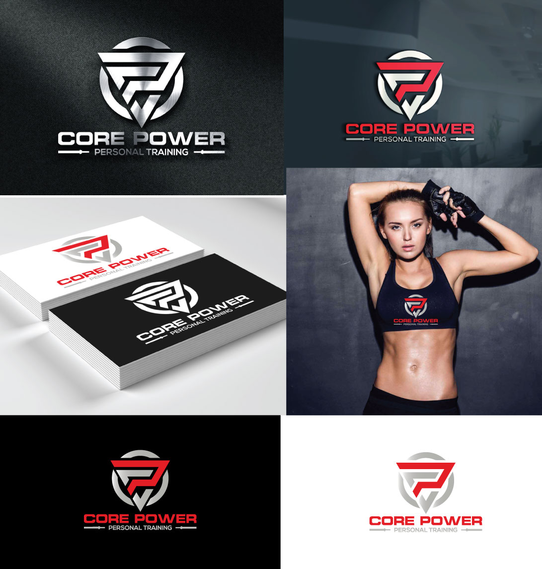
Core Power Personal Training Logo Design
A modern and minimal logo design crafted for a personal training brand, combining strength-focused visuals with a clean and premium identity.
Graphic Design
Project Type
Brand Identity (Logo Design)
Platform
Adobe Illustrator, Adobe Photoshop
Tools Used
2026
Year
Project Overview
The Brief
Core Power required a strong and professional logo to represent their personal training brand in the fitness industry. The objective was to create a distinctive identity that reflects strength, performance, and discipline while maintaining a clean and modern aesthetic.
Creative Approach
I developed a minimal and impactful logo concept focused on bold typography and symbolic representation of strength and movement. Clean lines, balanced proportions, and a refined composition were used to ensure versatility across different branding applications. The design maintains a premium and modern feel while clearly communicating the brand’s core values.
My Creative Process
My approach ensured the logo is both visually strong and adaptable across multiple brand touchpoints.

Research & Brand Direction
Analyzed fitness industry branding and defined a visual direction focused on strength, performance, and simplicity.
1 hour
Concept Development
Created multiple logo concepts exploring typography, symbols, and composition aligned with the brand identity.
2 hour
Design Refinement
Refined the selected concept with balanced proportions, spacing, and scalable design structure.
3 hour
Final Delivery & Brand Assets
Delivered final logo files in multiple formats with variations for different use cases (print, digital,
3
The Problem
Many fitness brands use generic logos that fail to communicate strength and professionalism effectively.
The Solution
This logo delivers a clean, strong, and memorable identity that enhances brand recognition and communicates a premium fitness image.
""The logo perfectly represents our brand strong, clean, and professional. It has elevated our identity and made a great impression on our clients.""
Michael Turner
Founder
Results
0 %
Brand Recognition Improvement
0 %
Client Acquisition Increase
0 %
Usage Versatility Score
More Projects
Explore more of my recent work in motion design and visual storytelling
Not limited to video,
I'm your creative comrade.
Got questions, project ideas, or just want to say hi? I'm all ears!
See My Works