label
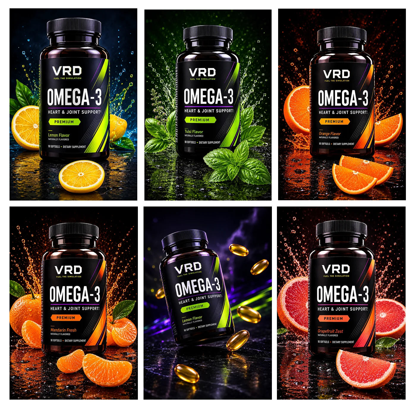
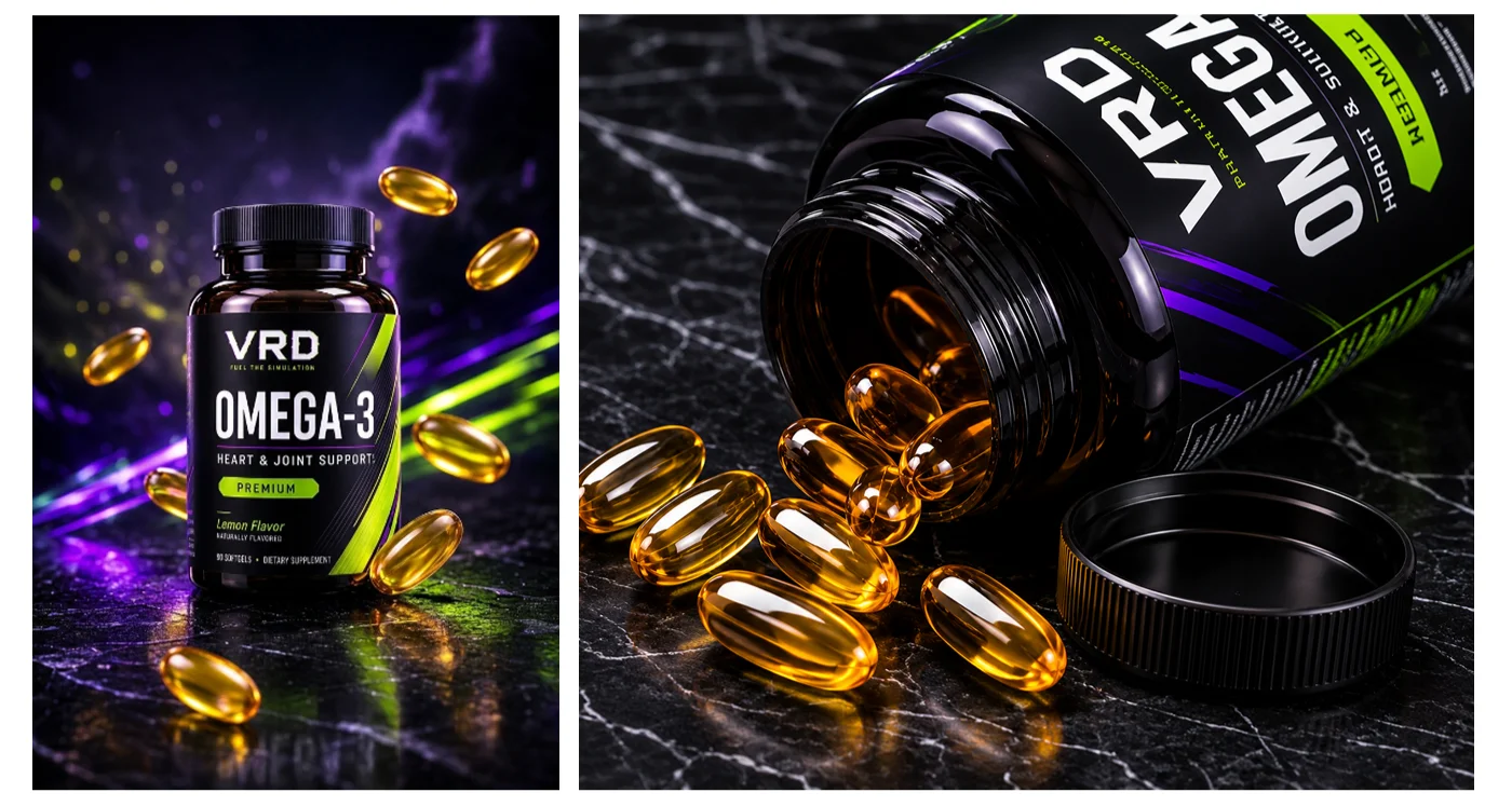
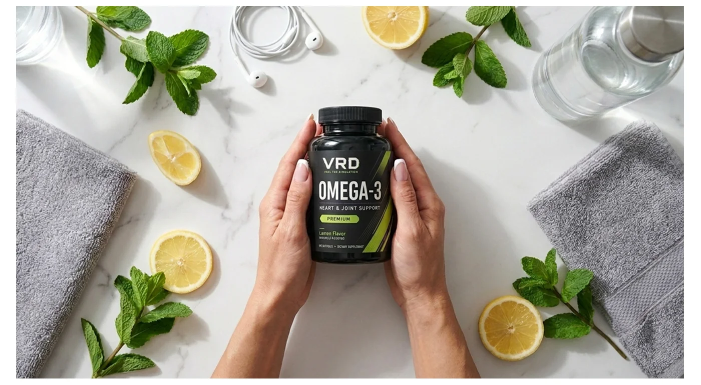
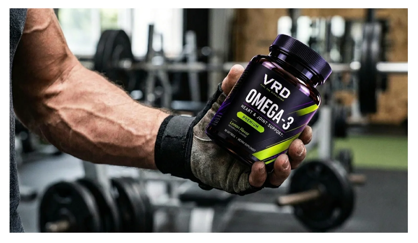
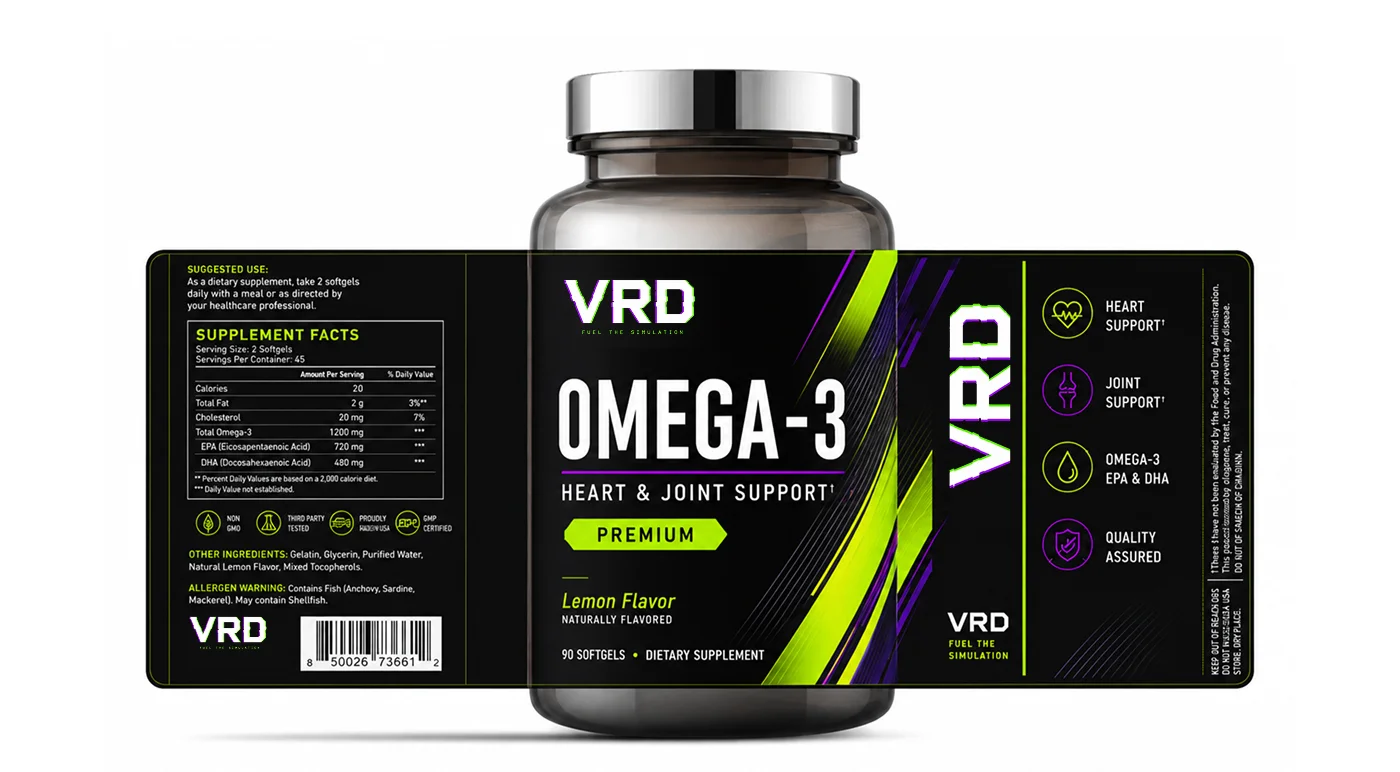
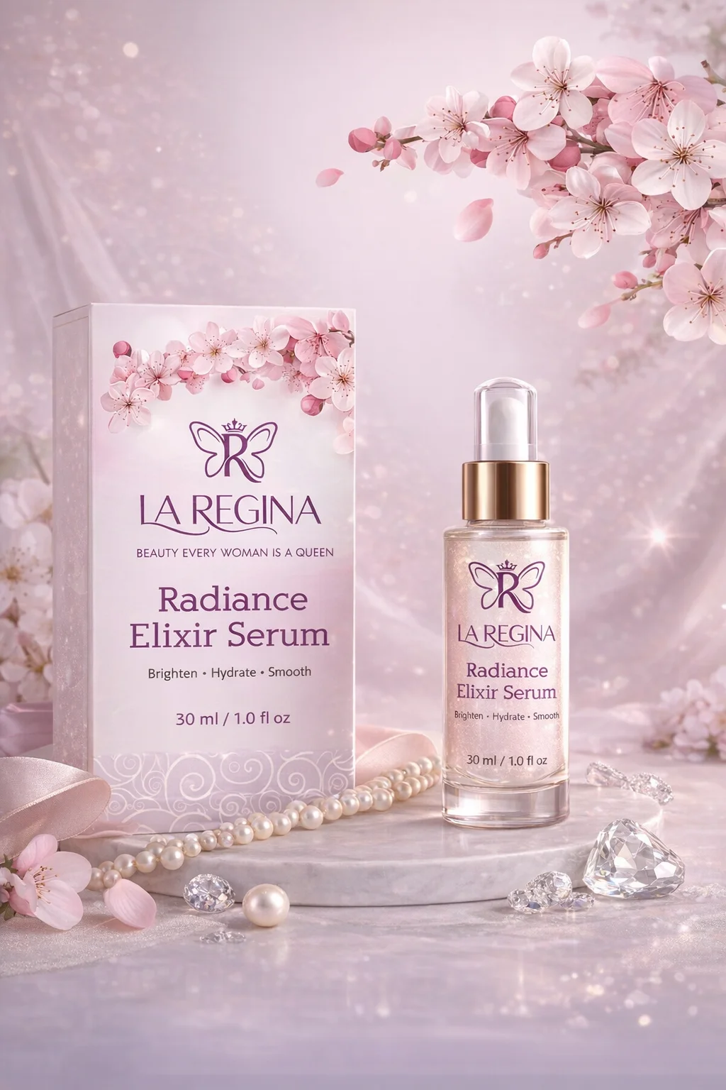
VRD Omega-3 – Heart & Joint Support Label Design
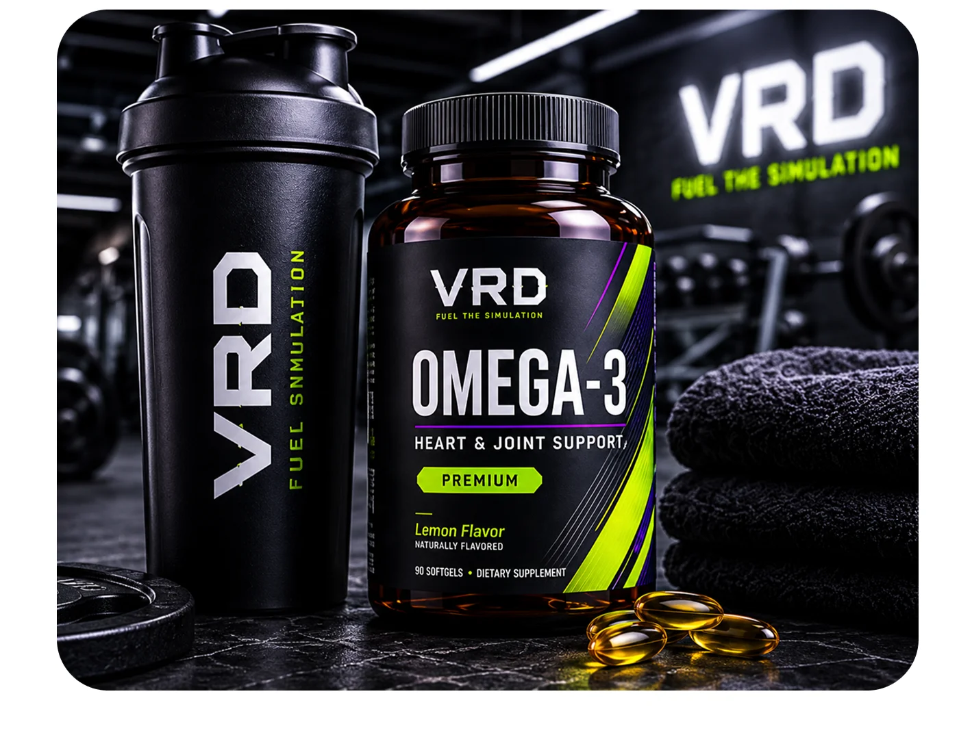
A clean and professional supplement label design created for VRD Omega-3, combining premium typography, clear product information hierarchy, and modern packaging aesthetics to enhance shelf appeal and brand credibility.
Graphic Design
Project Type
Product Label Design
Platform
Adobe Illustrator, Adobe Photoshop
Tools Used
2026
Year
Project Overview
The Brief
The project required a premium label design for VRD Omega-3 – Heart & Joint Support. The objective was to create a visually appealing and trustworthy product label that communicates the supplement’s key benefits while maintaining compliance, readability, and strong brand identity.
Creative Approach
I developed a clean and health-focused label concept using modern typography, structured information hierarchy, and balanced visual elements. The design emphasizes product benefits, ingredient clarity, and brand recognition while maintaining a premium and professional appearance suitable for the health and wellness market.
My Creative Process
My approach focused on creating a label design that enhances product visibility and consumer trust.

Research & Product Positioning
Analyzed supplement packaging trends and established a professional visual direction aligned with health and wellness branding.
3 hour
Layout & Label Concept Development
Created multiple label concepts focusing on readability, compliance, and product differentiation.
4 hour
Design Execution
Designed the final label using premium typography, organized information panels, and modern packaging aesthetics.
1 days
Final Output & Print Preparation
Prepared print-ready packaging files with proper dielines, bleed settings, and production specifications.
4 hour
The Problem
Many supplement labels appear overcrowded and make it difficult for consumers to quickly identify product benefits and important information.
The Solution
This label design delivers a clean, professional, and consumer-friendly presentation that improves product recognition and brand credibility.
""The label design looks professional, trustworthy, and premium. It clearly communicates the product benefits while maintaining a strong brand presence.""
Michael Anderson
Product Development Manager
Results
0 %
Shelf Visibility Improvement
0 %
Product Recognition Increase
0 %
Packaging Appeal Enhancement
More Projects
Explore more of my recent work in motion design and visual storytelling
Not limited to video,
I'm your creative comrade.
Got questions, project ideas, or just want to say hi? I'm all ears!
See My Works