label
Mia Secret — Strong-Jet Nail Glue Label Design | Cosmetic Product Packaging
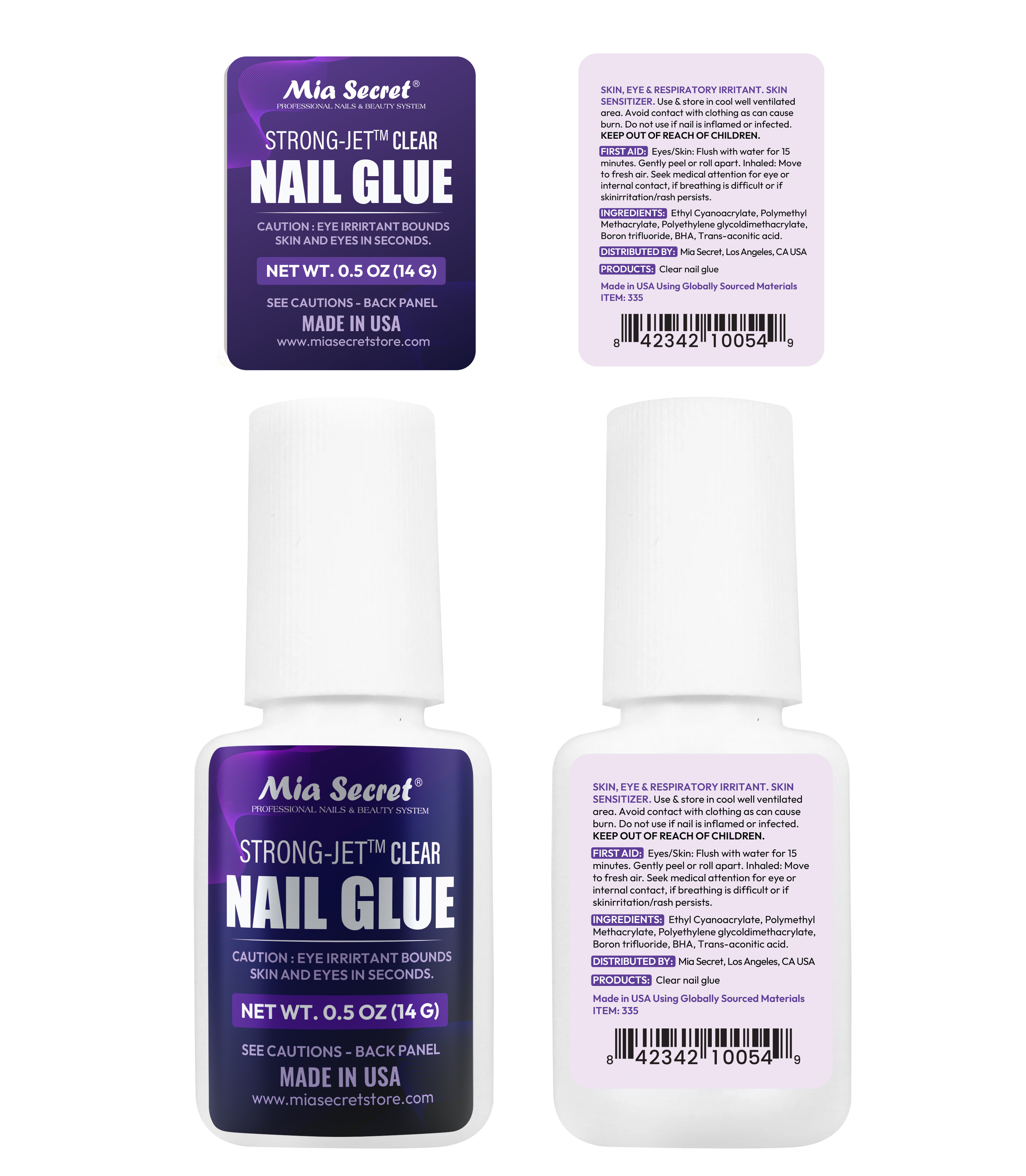
A professional product label design for Mia Secret Strong-Jet Clear Nail Glue, created to give the product a bold and recognizable appearance. The design combines a rich purple color palette, modern typography, and clear information sections to create an attractive and functional packaging label.
Cosmetic Label Design / Product Packaging
Project Type
Print Design / Beauty Product Packaging
Platform
Adobe Illustrator, Adobe Photoshop
Tools Used
2025
Year
Project Overview
The Brief
The goal was to design front and back labels for Mia Secret Strong-Jet Clear Nail Glue. The packaging needed to highlight the product name, weight, brand identity, safety warnings, ingredients, barcode, and other essential product information in a professional and organized way.
Creative Approach
I used a bold purple visual style with subtle gradient effects and elegant graphic details to reflect Mia Secret's professional beauty identity. The front label focuses on the brand and product name, while the back label presents the technical information in a clean and readable format.
My Creative Process

Research & Planning
I reviewed the product details and identified the essential information required for both front and back labels, including product specifications, safety instructions, ingredients, and barcode placement.
1 hour
Concept Development
I explored different purple-based layouts, typography styles, and graphic elements to create a strong visual identity that fits the Mia Secret brand.
2 hour
Design Execution
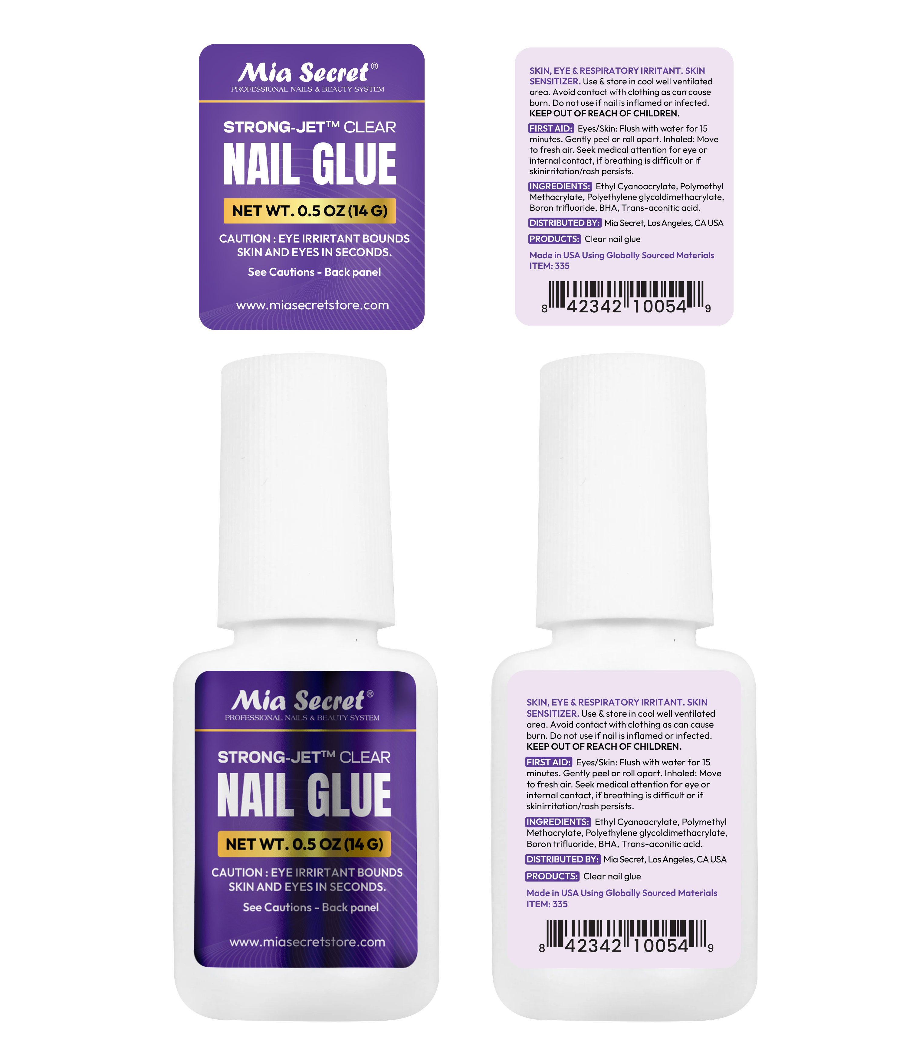
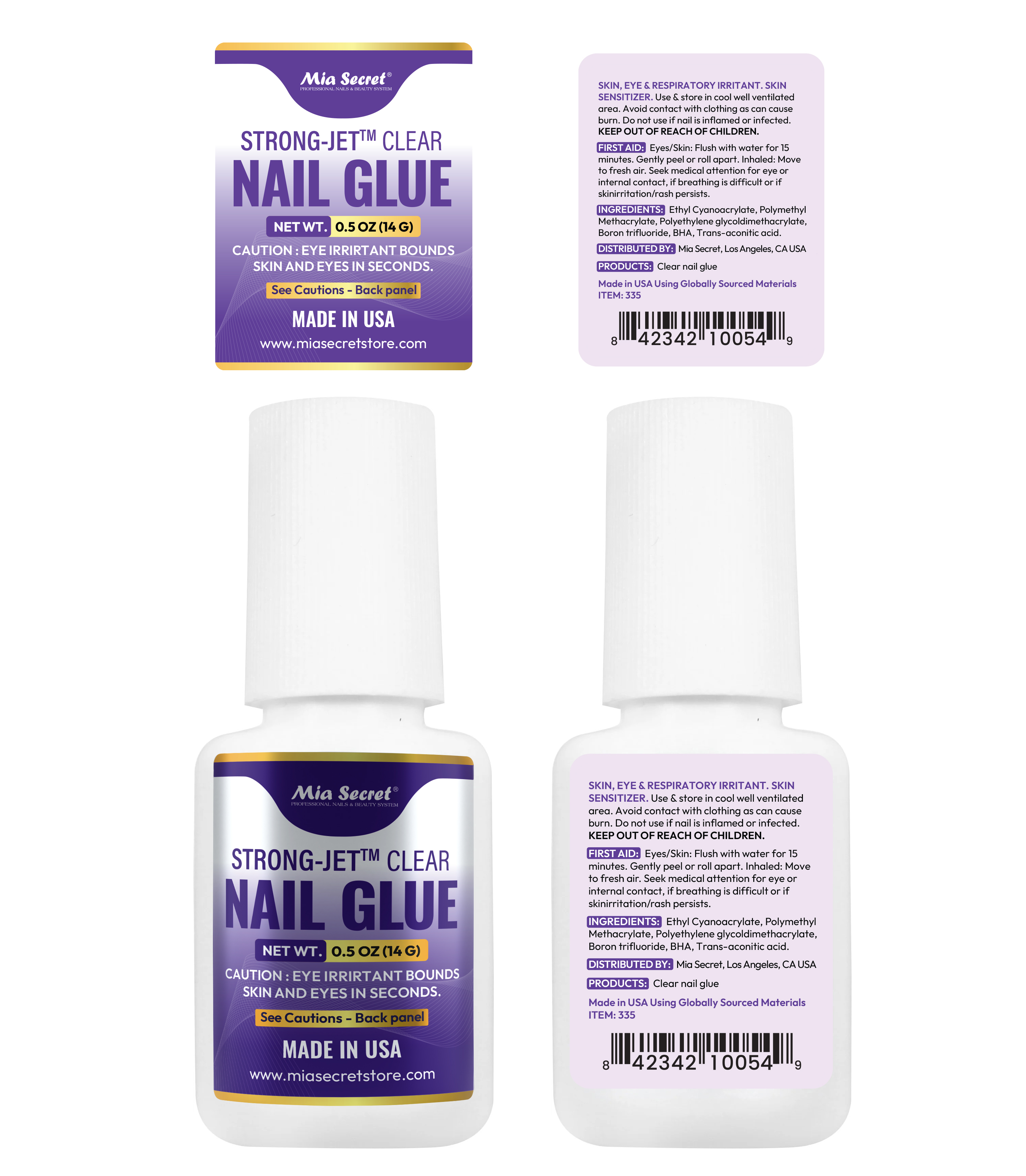
I designed the front label with a clear product hierarchy and created a matching back label with organized information sections. I also developed alternative visual versions while maintaining brand consistency.
4 hour
Final Optimization
I refined the typography, spacing, contrast, and label alignment to ensure the design looks balanced and the product information remains readable on the packaging.
4 hour
The Problem
I created a coordinated front-and-back label system with a strong visual identity and organized information layout. The front label highlights the product, while the back label makes the safety details and other essential information easy to locate.
The Solution
I created a coordinated front-and-back label system with a strong visual identity and organized information layout. The front label highlights the product, while the back label makes the safety details and other essential information easy to locate.
More Projects
Explore more of my recent work in motion design and visual storytelling
Not limited to video,
I'm your creative comrade.
Got questions, project ideas, or just want to say hi? I'm all ears!
See My Works